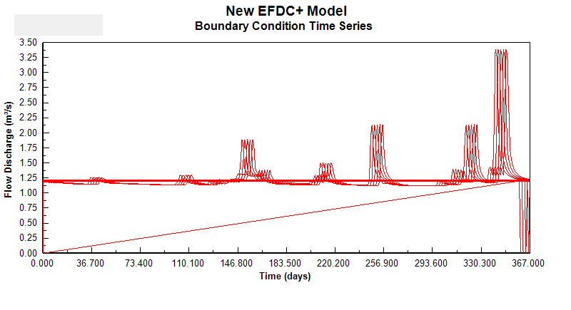
Hi, I am quite confused about this graph.
I used the ‘DM-14_Lake_T_HYD-WQ_Model_Example’ data from EEMS website.
As I following the step-by-step guidance, I encountered this graph but I can’t get the same graph as this.
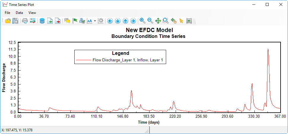
Did you use the flow time series from DM-14 on the EEMS website? I see your time series table with five layers is not like mine when I use this model with five layers. I assume that you use your own time series data and plot them with separate layers. Can you show the legend in your time series plot as my one, as shown in the image below?
Hello,
Thanks for your response and I’m sorry that I haven’t replied to you.
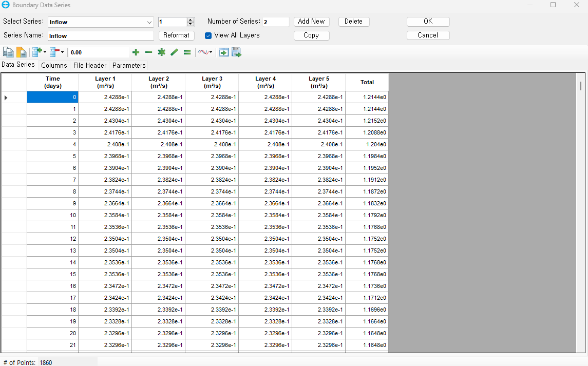
I have solved this problem by not importing ASCII example data. (I made the excel data and copy&paste it)
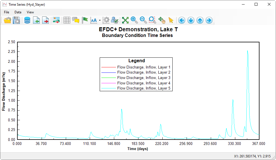
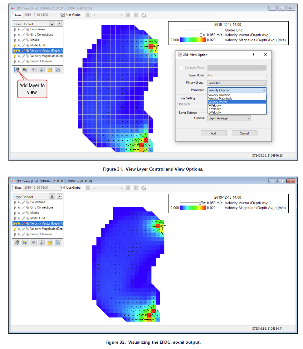
However, the tutorial shows this image of velocity vector.
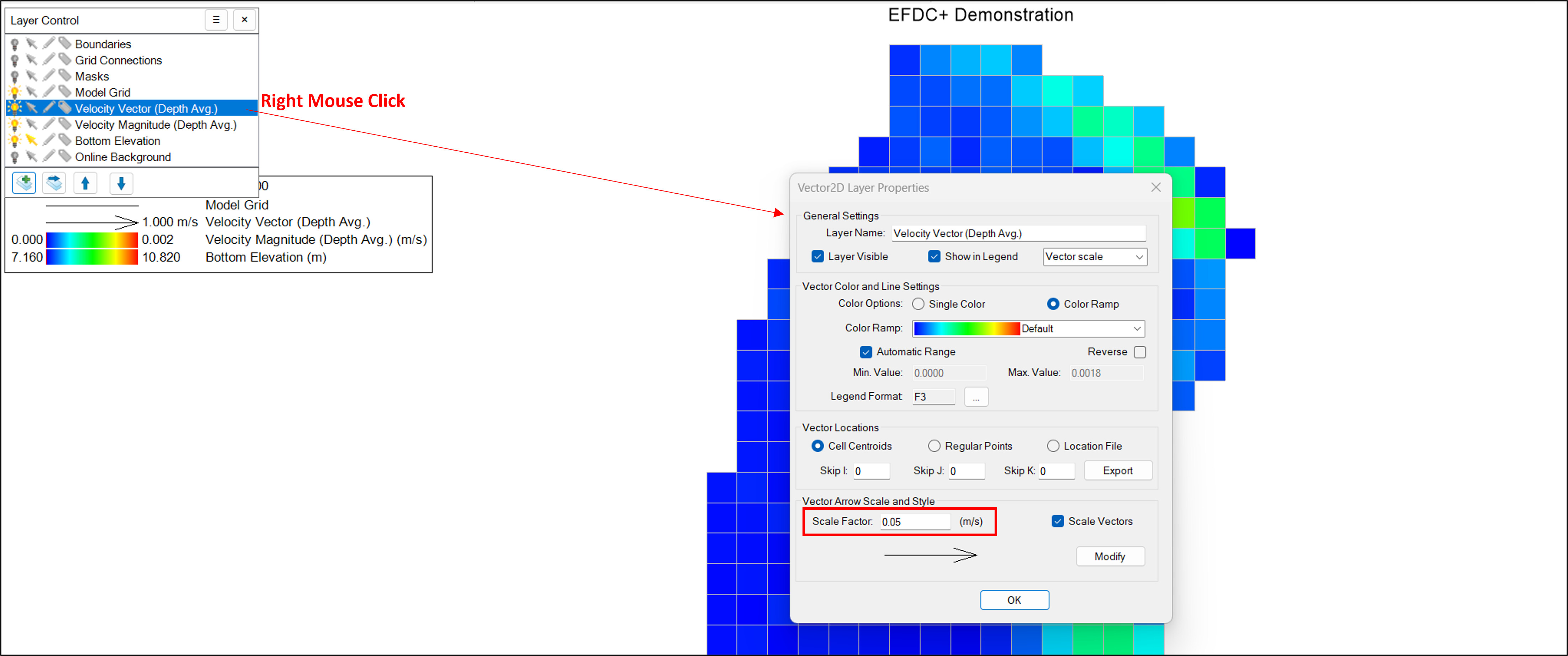
문의하신 부분은 Velocity Vector 의 디스플레이 스케일을 조정하시면 해결하실 수 있을것 같습니다.
예를 들어, Tutorial 예시 이미지에 있는 Vector 는 0.05 m/s 를 단위 길이로 사용하지만, 보내주신 비디오에서는 Vector 의 단위길이가 1.00 m/s 를 나타내도록 설정 되어서 아주 작은 유속을 가진 Vector 들은 디스플레이가 되지 않는것 같습니다. 아래 첨부해드린 이미지를 참고하셔서, Vector Velocity 레이어를 마우스 우측 버튼 클릭 하시고, Vector 스케일을 조정하시면 Tutorial 과 유사한 결과 이미지를 구현하실 수 있습니다.