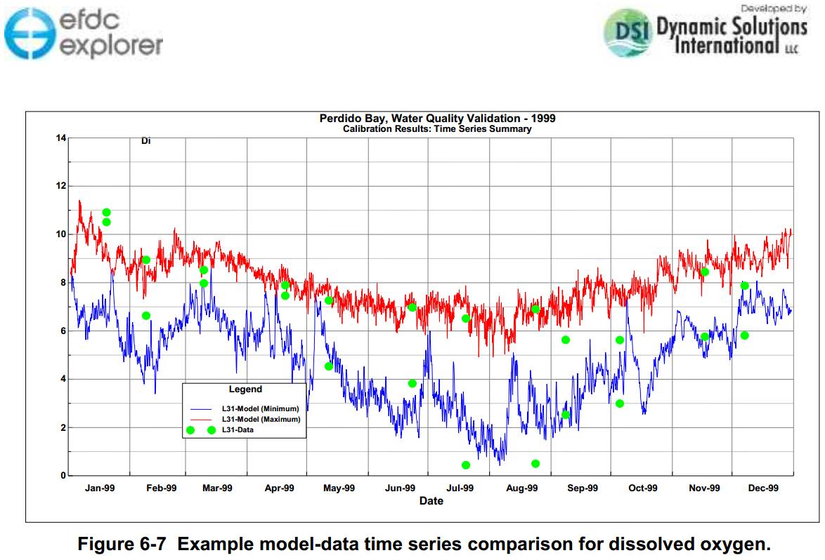
Hello, I read the EFDC manual (1.EFDC_Explorer8.1_Users_Manual-2016_07_08R00-A4) in the section 6.1.2.2 (Time Series Plots, as the link below), and can not figure out how to plot a diagram like the picture below. Anyone can help me to show me the way to get it, please? https://eemodelingsystem.atlassian.net/wiki/display/EEREF/Time+Series+Comparisons Thank you so much indeed. Attached files 
There are two models on this website that have measured data that you can use to create calibration plots similar to the one you are interested in. They Lake Washington (1.15) and Lake Water Quality (1.06) which are available for download from here: https://www.eemodelingsystem.com/user-center/modeling-resources/demonstration-models You should download the models, run them, and then select Model Analysis > Model Calibration > Time Series Comparison > Plots as shown in Figure 1 here: https://eemodelingsystem.atlassian.net/wiki/display/EEREF/Model+Calibration You may need to adjust the line style and symbols as required for data vs model.